RADO MOVING MATERIALS 2025

The Swiss watch manufacturer Rado is known for the independent and visionary design of its watches and the use of revolutionary materials. The brand is a relevant and dynamic player on the international design scene and is particularly proud of its collaborations with international designers. As a long-standing partner of the VIENNA DESIGN WEEK, Rado is once again contributing to the festival programme this year.
What has connected Rado and the VIENNA DESIGN WEEK since the beginning of their partnership is the support of up-and-coming design talent. Following on from the last two years, the RADO MOVING MATERIALS competition will give six designers from the field of motion design the opportunity to present their installations, specially produced for the video wall in the Rado Boutique in Vienna (Kärntner Straße 18), to a wide audience.
From March to August, a new animation will be shown for one week each month. All the animations will then be shown again in the VIENNA DESIGN WEEK 2025 programme from 26 September to 5 October - and it will be announced which of the six projects has won the RADO MOVING MATERIALS prize.
WATCH ALL THE VIDEOS HERE.
The six participants:
27.3.2025 Jakob Jakubowski(AT)
24.4.2025 Alexandra Dzhiganskaya (UA/AT)
22.5.2025 Gabrielle Schauerhuber (BRA)
26.6.2025 Vincent Wagner (AT)
31.7.2025 Céline Hurka & Jules Janssen (DE + NL)
28.8.2025 Verena Repar (AT)
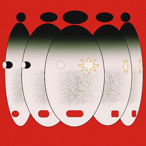
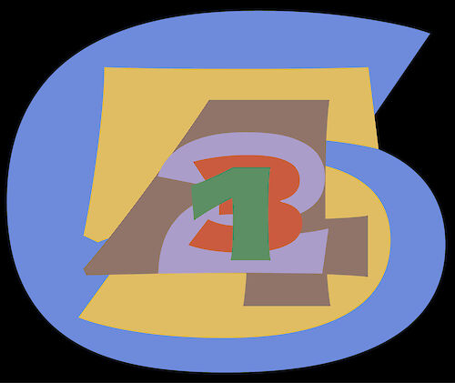
FOLGE 1: KUBAKUB
DIE SCHAIBE
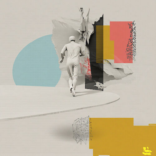
‘Die SchAIbe’ is a paradoxical experiment between chance and control. On a rotating surface that is simultaneously a clock face, a model of the world and an AI projection, a figure wanders through fragments of a de-centred reality. The work is not only a video, but also a threshold space that raises questions: Are we the observers - or the observed? The figure, a Sisyphus of the digital age, does not run through time, but is trapped in it. Material worlds mutate under this pressure: precision becomes a façade behind which chaos lurks. The work does not celebrate technology, but exposes it as an archived belief in progress and control. In the end, all that remains is the realisation that we are pilgrims on a disc whose edge has long since slipped into the algorithm.’ - Kubakub
KUBAKUB
The artistic pseudonym of Jakob Jakubowski, a Viennese architect, 3D artist and filmmaker whose work oscillates between the tangible and the virtual. A graduate of the Academy of Fine Arts Vienna (2022), with a degree in art and architecture, Kubakub combines disciplines to create immersive narratives that challenge conventional perceptions of space and form. For Kubakub, the virtual world is a laboratory for social reinvention. His projects explore how digital landscapes can promote emancipatory forms of expression - a dialogue between Vienna's municipal building heritage and speculative visions of the future.
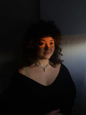
FOLGE 2: Alexandra Dzhiganskaya
NEVER NOT MOVING
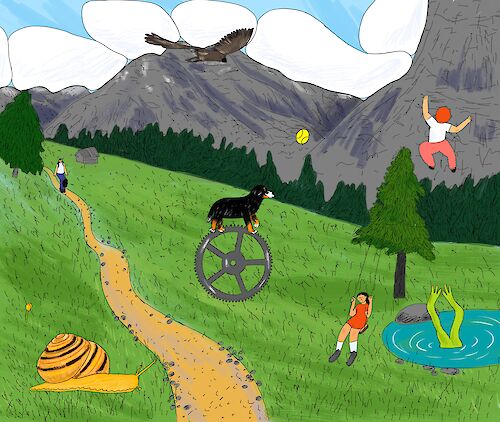
“In ”Never Not Moving", we explore the pulsating life against the backdrop of the majestic Alps. The animation unfolds in an endless loop, capturing the unstoppable flow of time. Each character embodies their own pace and rhythm, emphasizing the different ways we experience life despite sharing the same vast world. This evocative scene celebrates the rhythm of life and reminds us that we are all part of a larger narrative. It invites the viewer to reflect on their relationship with time and appreciate the beauty of movement in all its forms." – Alexandra Dzhiganskaya
ALEXANDRA DZHIGANSKAYA

Alexandra is an award-winning Ukrainian animation filmmaker, visual artist, director and illustrator currently based in Vienna. She holds a Master of Arts from the University of Applied Arts in Vienna and is passionate about creating captivating visual narratives and atmospheres that leave a lasting impression. In her work she combines reality and drawing and explores collective and personal memories.
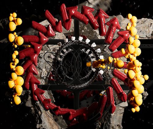
FOLGE 3: Gabrielle Schauerhuber
THE ART OF MUSIC
The Art of Movement and Music share a common essence: Time. What would movement be without connecting it to music? Together, they transcend and complement each other. When music notes and lines meet, a new language is born. In this 2D animation, made frame by frame, The invisible union is connected and explored. Both are born from rhythm, breathe in the interval, and exist in the passing. And in this connection, they reveal another way of feeling: where silence gains form and movement, voice.
GABRIELLE SCHAUERHUBER
Born in the tropical Brazilian lands, Gabrielle Schauerhuber is an Illustrator, Animator, and Art Director. Since 2017, she has been developing her work in the advertising field, bringing more fun, color, and charisma to brands. Her work features warm colors, exaggerated and distorted shapes, a mix of techniques, and an authentic design that floats between the figurative and the abstract.
FOLGE 4: Vincent Wagner
ARROW OF TIME
How does the measurement of time shape our understanding of temporal processes? Does it make us aware of the finiteness of our existence or is it rather the experience of this finiteness that gives timekeeping its significance? In moving images, we experience time and motion as a sequence of static states, with their speed defined by the number of frames per second. Unlike movement through space, we cannot control our movement through time. The static moment can only be captured technically, as a still image, but removed from the flow of time, the individual moment remains elusive. "Arrow of Time" is an attempt to explore the relationship between timekeeping, temporal perception, and the idea of motion as a succession of static states.
VINCENT WAGNER
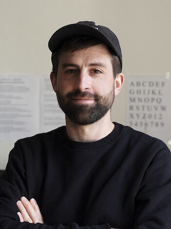
Vincent Wagner is a freelance designer based in Vienna, specializing in 3D animation at the intersection of branding, motion, and storytelling. His work often includes typography as a vehicle for emotionally charged visual communication, while other times he explores more abstract motion graphics. Partnering with studios, agencies, and production companies Vincent helps to translate ambitious concepts into thoughtful, contemporary animation.
FOLGE 5: Céline Hurka & Jules Janssen
GRANULAR TIMING
The piece engages with familiar clichés that dominate artistic discourse around the concept of time: hyper-productivity, temporal subjectivity, and the desire to measure the unmeasurable. Entirely typographic, the film uses variable font technology as a storytelling tool, unfolding in an infinite loop where scenes glide seamlessly between light and dark modes of contemporary interfaces. It gently mocks our compulsion to capture and represent something as fleeting and immaterial as time itself.
Granular Timing also responds to the notion of “granular time” as introduced by Silvio Lorusso in his text for the Post-Consumerist Research Network Garden (www.0000.garden):
“…so let’s make sure not to bring clock or stopwatch in when they’re not needed.”
CÉLINE HURKA & JULES JANSSEN
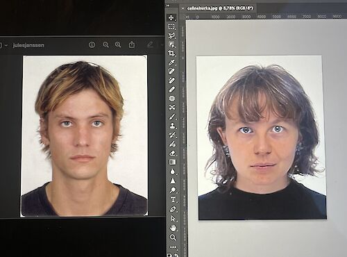
Céline Hurka is an independent type designer based in The Hague, NL and originally from Germany. In her practice, she aims to play with, question, and break the conventions that have prevailed for the past hundreds of years. She is fascinated by how meaning is attached to form and transforms over years of usage in different contexts. Since 2023 she runs her own type foundry and expands her collection inspired by her long-term interest in type history, technological innovation, personal stories, pop culture, flowers, and universal emotions.
Jules Janssen is a Dutch designer currently working for Grilli Type in Berlin. (He) also runs a graphic design practice on the side with a strong focus on clients in the arts, fashion, media and music.
For a while, Céline and Jules lived in apartments on opposite sides of the same street, just one house number apart, next to the royal stables. During this time, they started burning paper, going for long stormy walks, and began collaborating on typefaces and animations. Now, they’ve swapped countries and continue their sporadically shared practice remotely. Their work is shaped by a fascination with everyday phenomena, silly ideas, and a shared obsession with labour-intensive production processes. Their most well-known project, a typeface called Letters, was exhibited by Biceps Editions in Marseille and is part of the Velvetyne catalogue.
FOLGE 6: Verena Repar
TEMPORAL SKIN
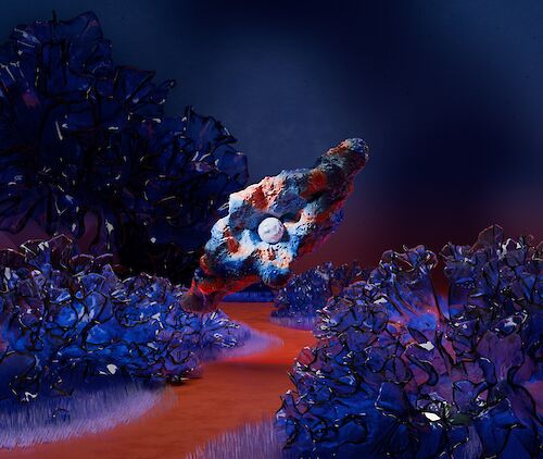
“An inanimate body carries its history in its materiality. It is its skin, which is constantly changing and refers to the past. Material exists as a carrier of time; its traces reflect what has been lived. Abstract bodies awaken, oscillate in temporal cycles, unfold, and pass away in a ceaseless flow.”
VERENA REPAR
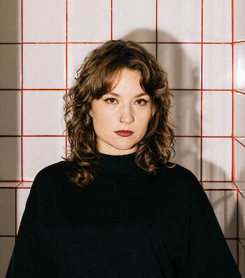
Verena's short films have won multiple international awards. She works at the intersection of design, new media, and social issues, combining her creative practice with journalistic and research-based approaches. During her studies at the University of Applied Arts in Vienna, she developed a passion for visual storytelling and animation. In addition to her work as a motion and graphic designer, she creates audiovisual performances in collaboration with musicians and sound artists.